I started my latest class with Peter Markham today after some technical hiccups. With his laptop out of order, he was borrowing his wife’s machine to lead class on a freshly installed Zoom. It happened to have that auto-framing feature turned on. You know, the one that automatically tracks and reframes your head if you move around?
Although today’s class was the kickoff of his month-long Deep Screenplay Analysis course and was more focused on the screenwriting side of things (for now), my mind couldn’t help start running at the visual results of the auto-framing. A Zoom call with Peter tends to be an environment that’s very much focused on the language of the screen. And the auto-framing feature doesn’t come anywhere close to a language.
It’s technical, mechanical, and a perfect example of mindlessly following set rules, directions, or parameters without ever questioning why or to what effect. No one’s at the wheel. No one’s making in-the-moment micro-decisions. It’s certainly not intentional.
The whole thing reminded me of how I often had to remind both the layout and animation departments that it’s perfectly okay for the characters’ hats to get cut off by the edge of frame when I was directing on Camp Snoopy…
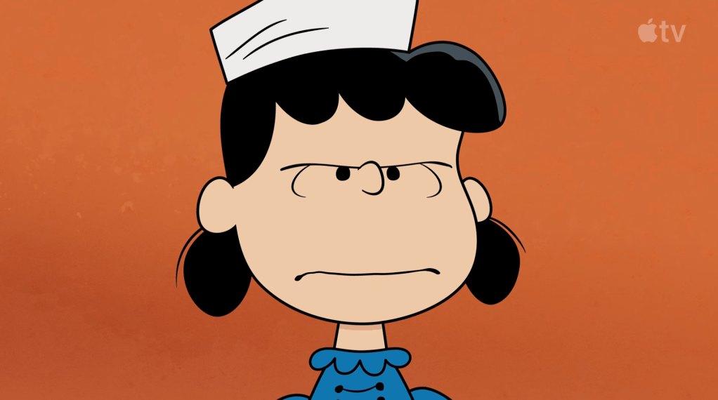
At one point or another, members of the crew have probably been told that characters’ heads should not touch or get cut off by the edge of frame. A rule. Something that’s just not done.
“Headroom,” they’ve been told.
I think it’s not an uncommon approach in your standard animated production.
(Don’t quote me on that, though. Like I’ve mentioned before, I’m not watching a ton of them anymore…)
In live action? Different story.
And that’s where I get my cues in how I approach the frame. I’m aware of it, absolutely. I’d say I’ve never been more aware of it, but it’s also an awareness that feels like it grows by the day.
But it’s not made of lava.
Framing choices communicate just as much (maybe more?) as what’s inside the frame.
By choosing to frame a character’s hat completely within a frame, you’re giving it just as much importance as the character’s face and their expressions. Which is rarely what a shot calls for.
Consider the images below featuring Cossack man from the steppes of Russia (from New York Public Library’s collection of photographs of Ellis Island):
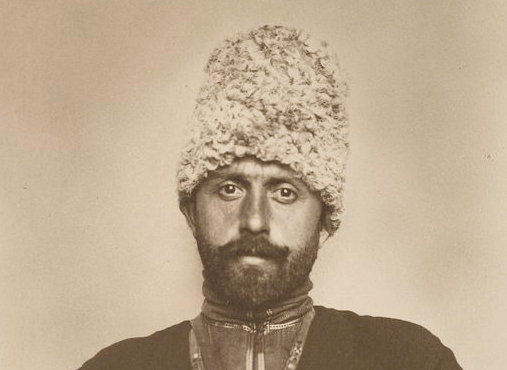
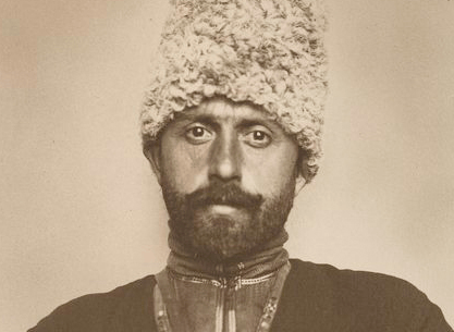
Two different framings (but both following the Academy ratio of 1.37:1), producing two very different focuses.
It’s not that either one is inherently right or wrong. It all depends on what you want to say.
What about the images below of Woman carrying bundle on head (from New York Public Library’s collection of photographs from the Farm Security Administration Collection: 1935-1944)?
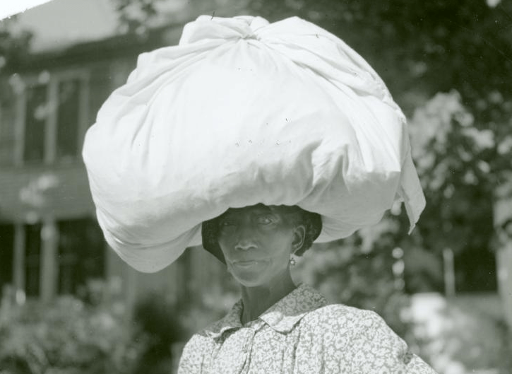
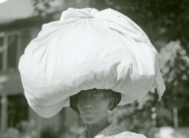
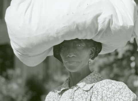
As was the case with the Cossack man and his hat, we might want to feature the huge bundle balanced on the woman’s head and use something along the lines of the first image. But not at the expense of her face, like in the second image. But if what’s important in the shot is the person (and not their outfit), something along the third image will be a much more effective choice.
Because, again, it should always be just that: a choice.
The frame cutting things off isn’t inherently bad! That assumption being the norm makes for a very limited language on the screen.
Which… it can be a choice. Just make sure that it is. Ideally, with a reason in mind.
While we’re on the topic of framing…
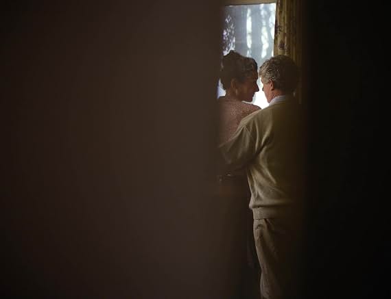
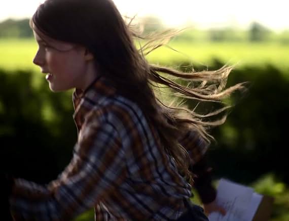
I recently caught Colm Bairéad’s stunning feature debut An Cailín Ciúin (The Quiet Girl) (2022) (on Kanopy! Support your local library!) and was absolutely blown away by the way he used the camera. While nine year old Cáit certainly is quiet, I felt as if the camera carried a conversation with me the whole time…
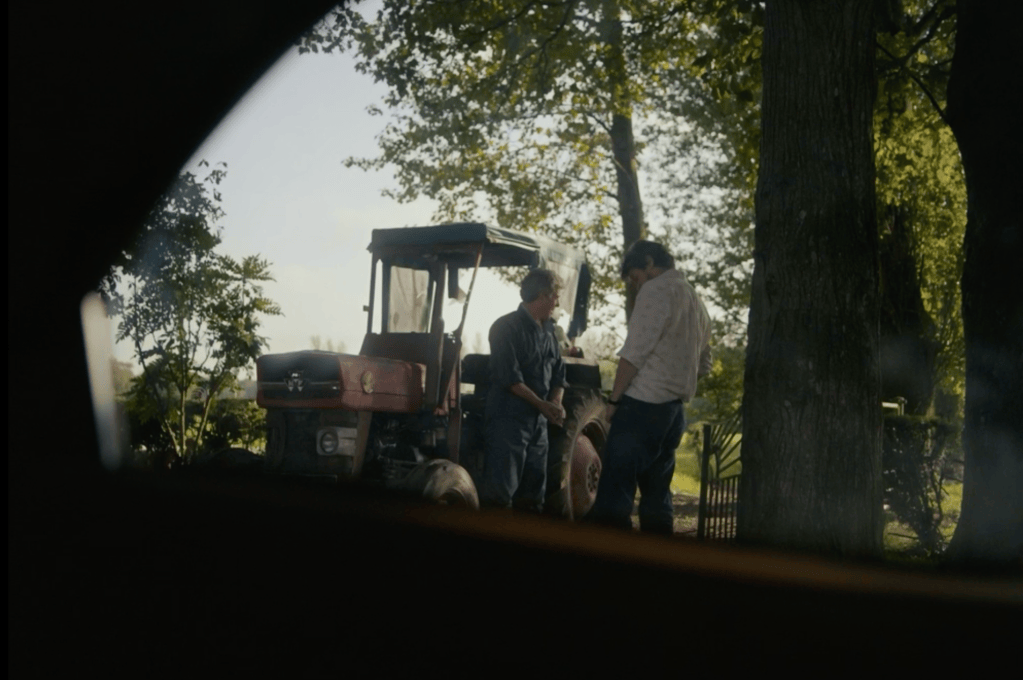
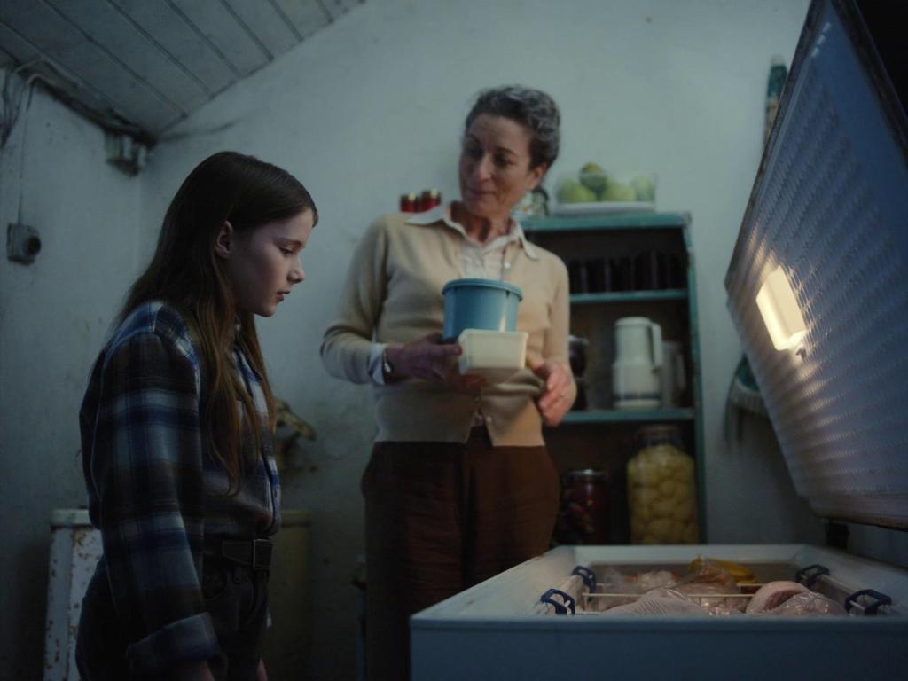
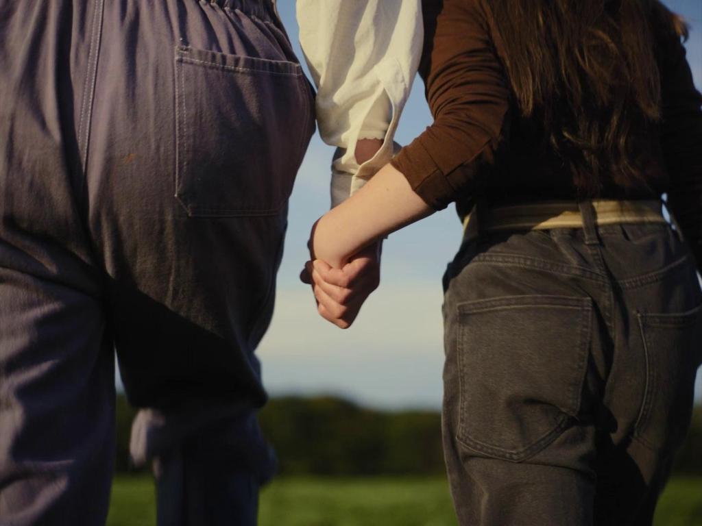
In terms of narrative point of view, we’re very much with Cáit throughout the majority of the film. Not to say that the whole thing is told in POV shots, but the camera is kept deliberately low, with a view of the wold much closer to that of a child than an adult’s.
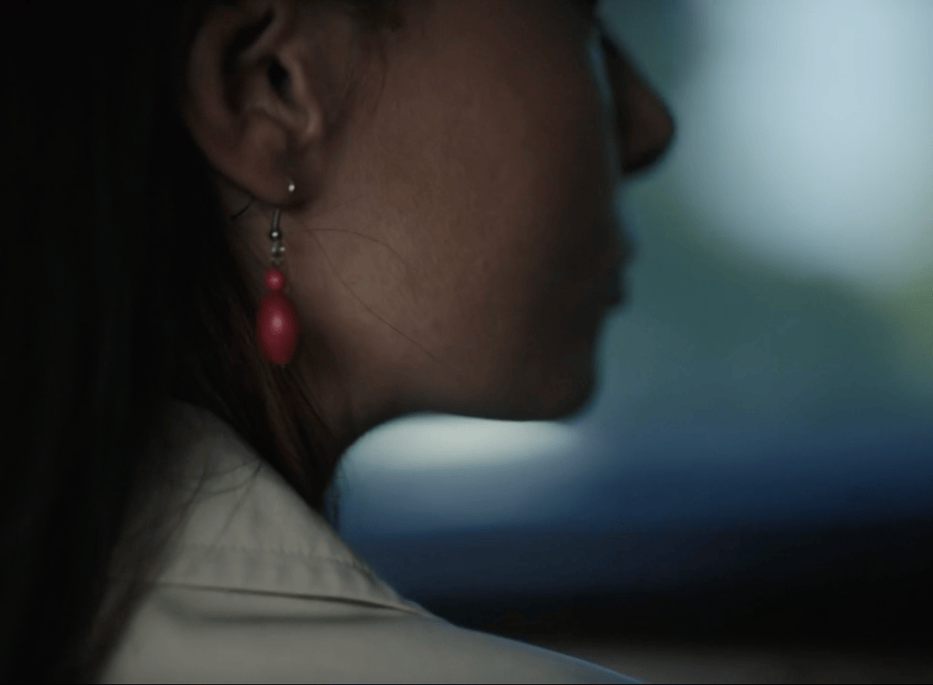
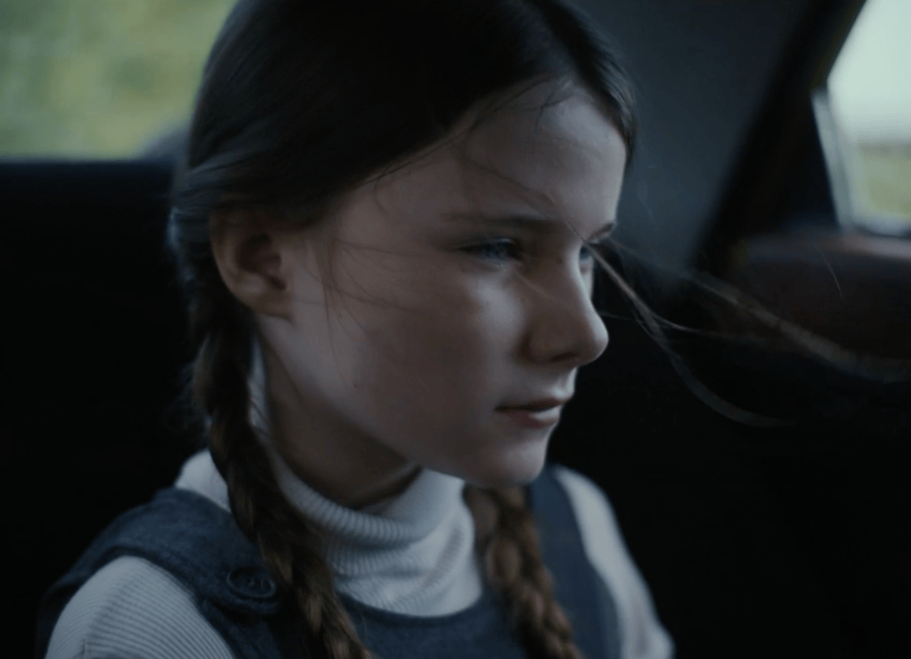
The POV shots, when they were employed or suggested, were usually used first, followed with a shot of Cáit.
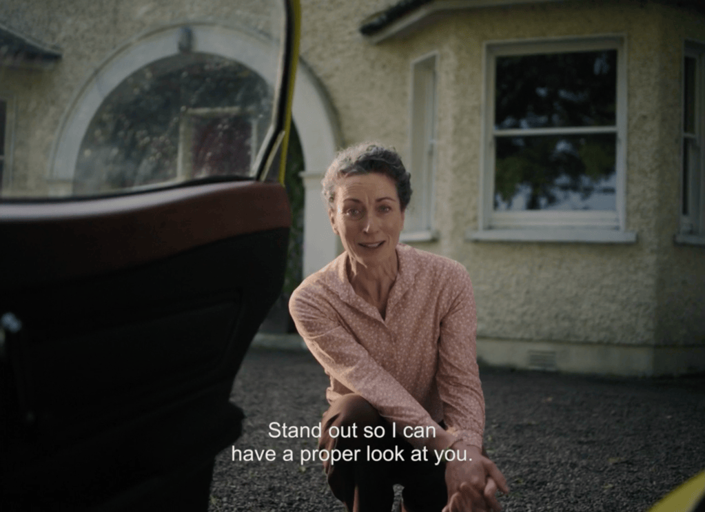
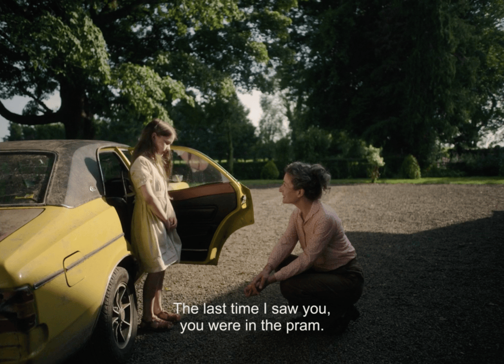
In addition to being absolutely delightful, it was such an effective way of keeping me on the edge of my seat and thoroughly engaged and delighted throughout the film.
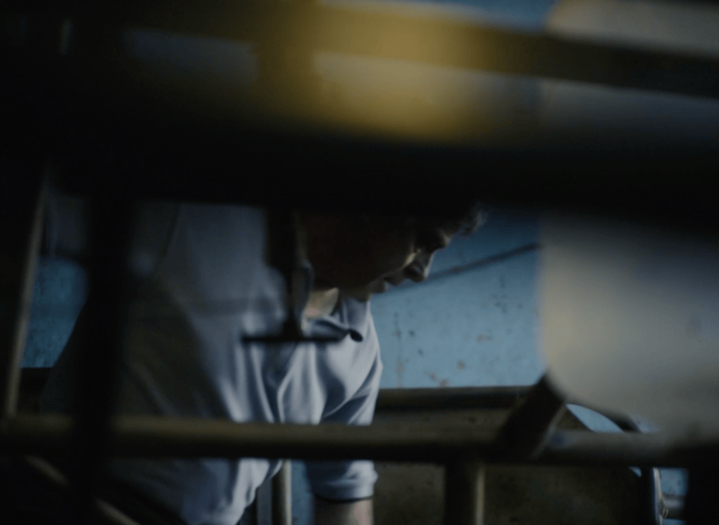
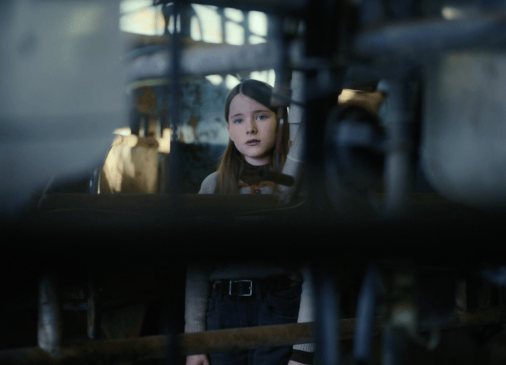
The Quiet Girl isn’t afraid to colour outside the lines, and I loved that about it.
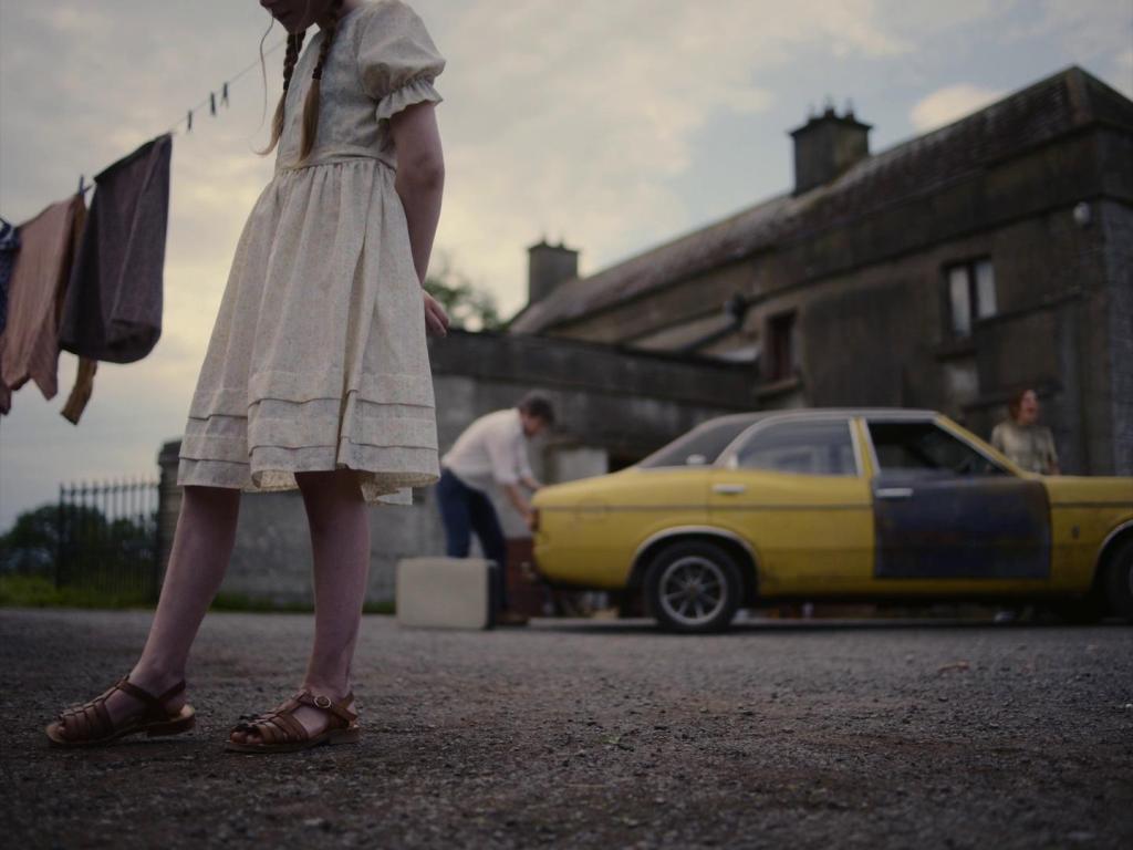
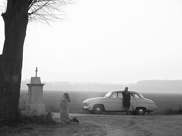
On the other end of the spectrum, consider Pawel Pawlikowski’s Ida (2013) and the omnipresent void above the characters’ heads:
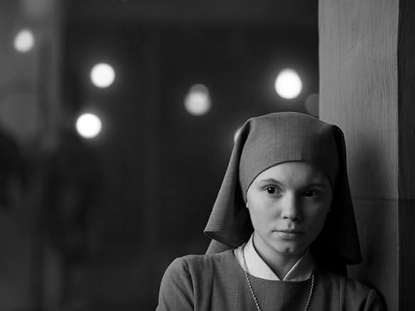
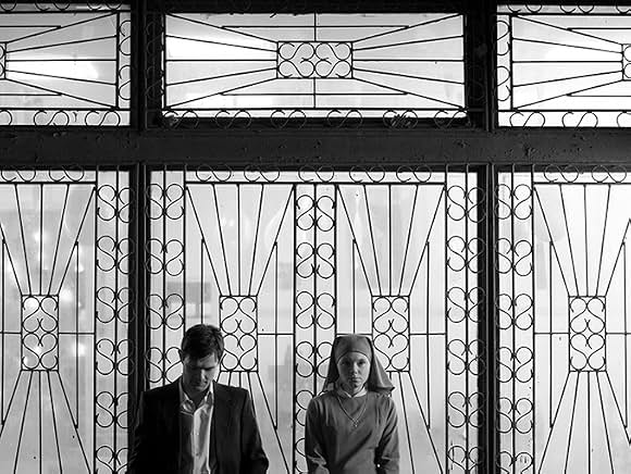
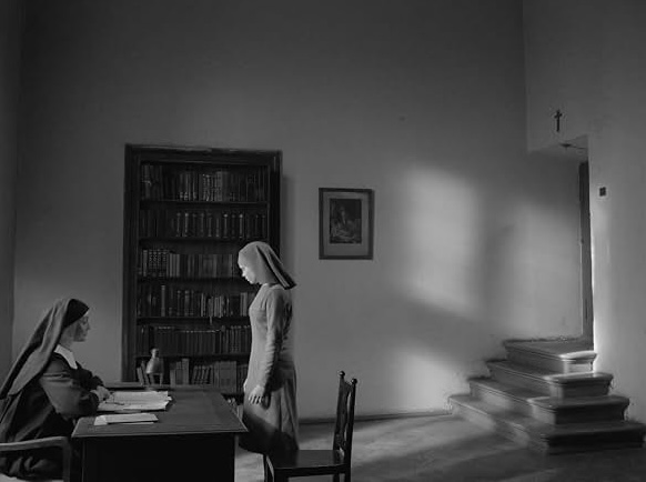
An unusual approach for sure, but given the roles that both religion as well as the past and its ghosts play in the film?
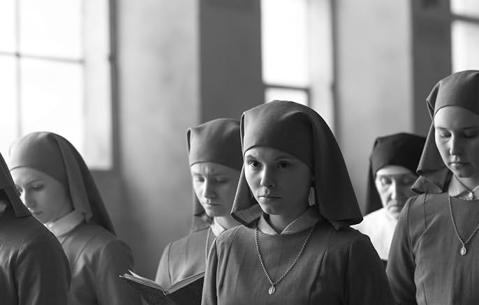
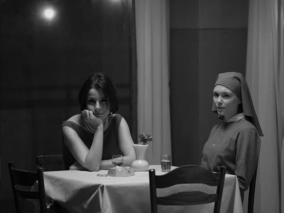
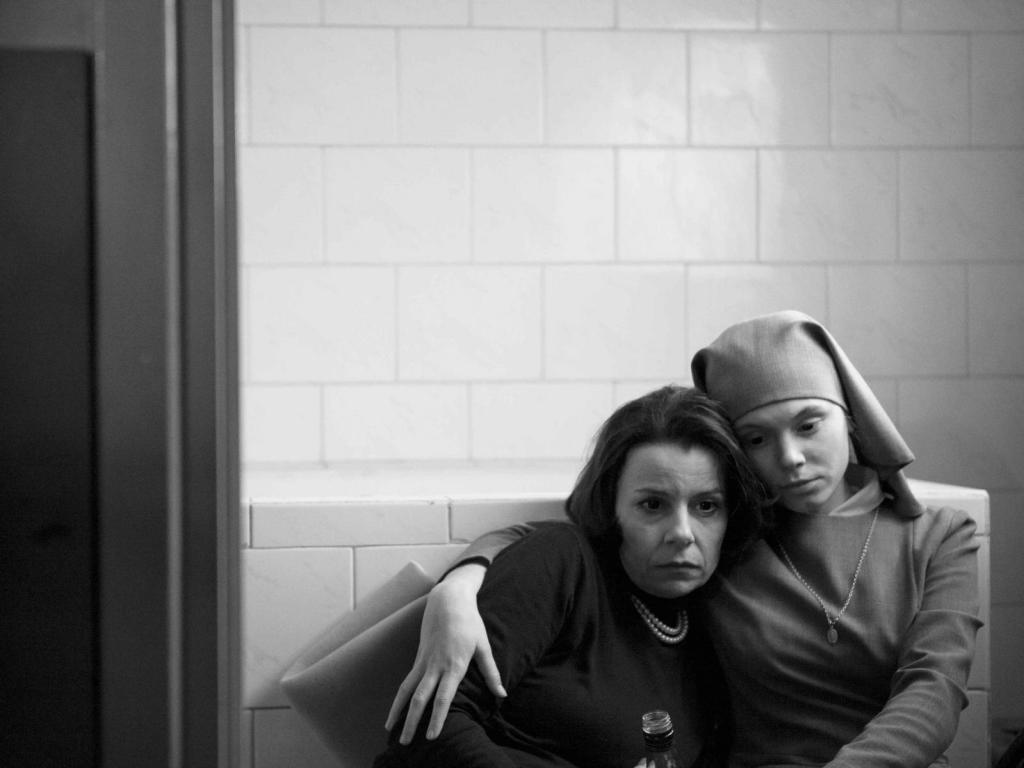
Chef’s kiss.
So yeah.
Miss me with your AI doomerism.
Excuse me while I defiantly laugh as the tech bros, the suits, and their sycophants threaten to replace us with their “fancy” gadgets.
May your desire to completely miss the point never find me.
 MÉLANIE DAIGLE