(Specifically, anamorphic lenses.)
Full disclosure: I am not a cinematographer. But I can get nerdy about stuff!
I first read about the anamorphic process in an outdated copy of the ASC’s American Cinematographer Manual I stumbled on at the library.
(Outdated’s not exactly the right word here… even though technology progresses, there’s no such thing as outdated information. If anything, the skills and knowledge relating to older methods of doing things tend to become ever more valuable… but that could be a whole other post!)
Anyway, reading that people somehow figured out that you could get a wider aspect ratio and make the most of 35mm film stock by shooting a smooshed image and projecting it with a reversed lens to un-smoosh it basically made me go 🤯.
So why are anamorphic lenses on my mind?
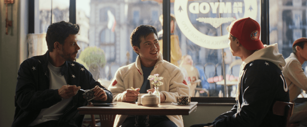
Among all the discourse going around, you may have heard that Heated Rivalry used anamorphic lenses. Or you may have just noticed the tell-tale artifacts that show up on the screen that you don’t get with “regular” optical lenses.
We should start with the screen itself and point out the aspect ratio of 2.4:1 rather than the more conventional 16:9, which matches the anamorphic format. Though, with digital shooting methods, aspect ratio alone doesn’t guarantee that anamorphic lenses were used.
Technology evolved past the need for the anamorphic process to get wider images… but the lenses remain! Their optical by-products have since become the reason they’re sought out for production.
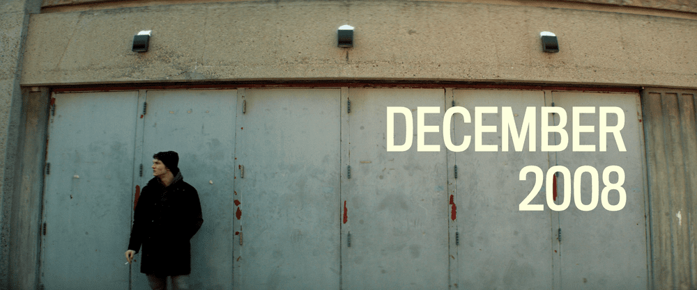
A fairly obvious signature of anamorphic lenses, if you know to look for it, is an increasing distortion of vertical lines and blurring the closer you get to the edge of the screen. It’s less of an issue on modern lenses, but it still shows up in wider shots:
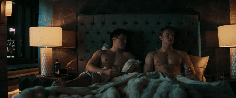
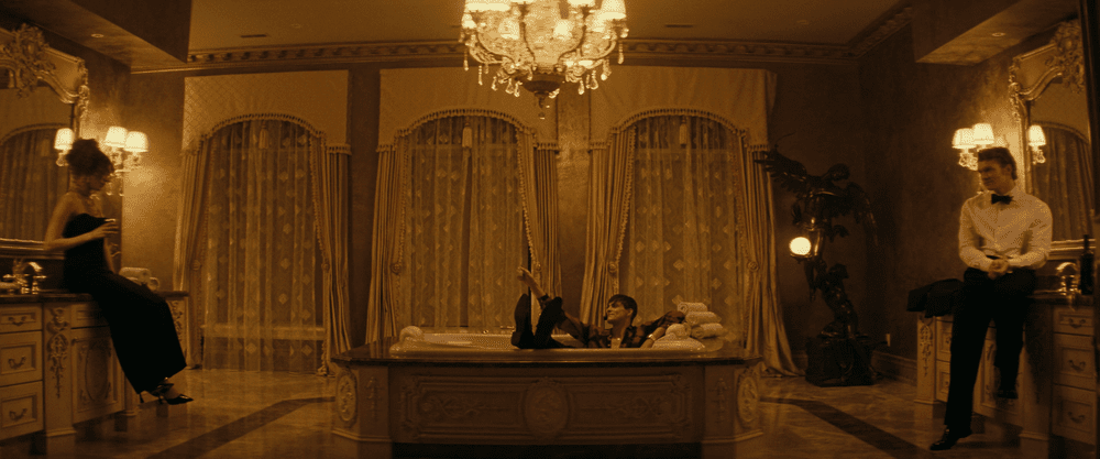
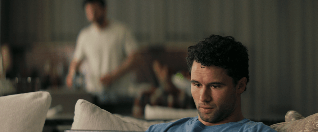
You also need longer anamorphic lenses to achieve the same shot with a spherical setup, which means that the anamorphic shots have a narrower depth of field of the two:
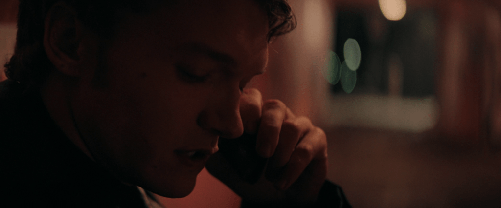
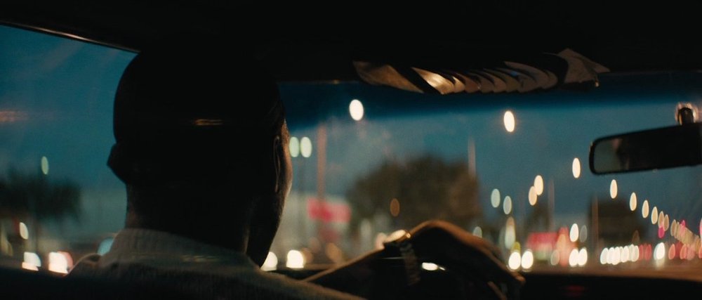
These shallow depths of field also give us a beautiful bokeh, with blurred light sources appearing as oval shapes rather than circular:
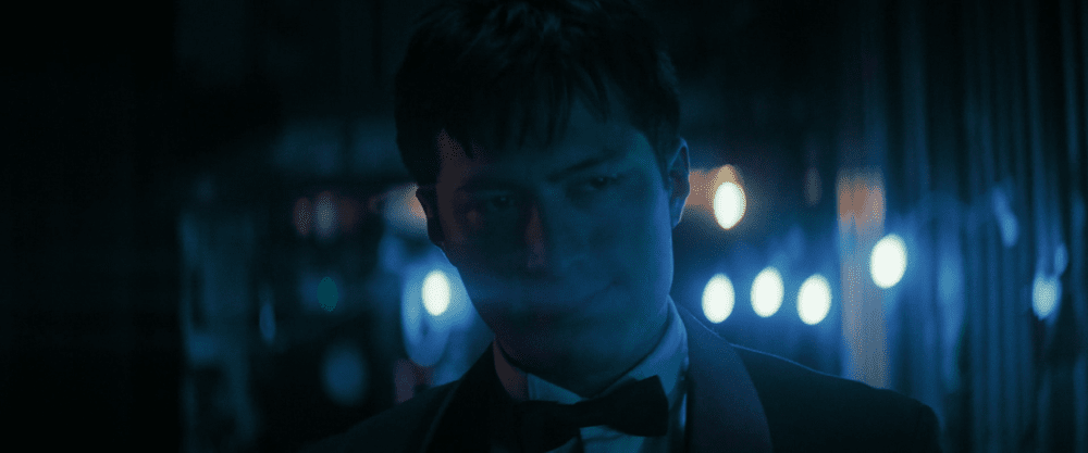
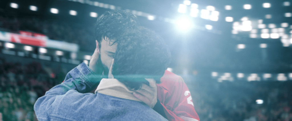
Horizontal lens flares (with blue light, specifically) are also another tell-tale artifact of anamorphic lenses:
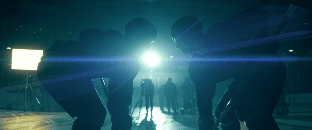
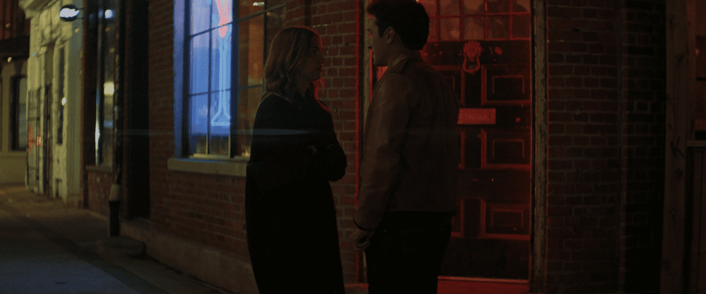
Finally, this one’s harder to demonstrate in still images, but when you rack focus with an anamorphic lens, the part of the image that falls out of focus appears to “breathe” and expands vertically:
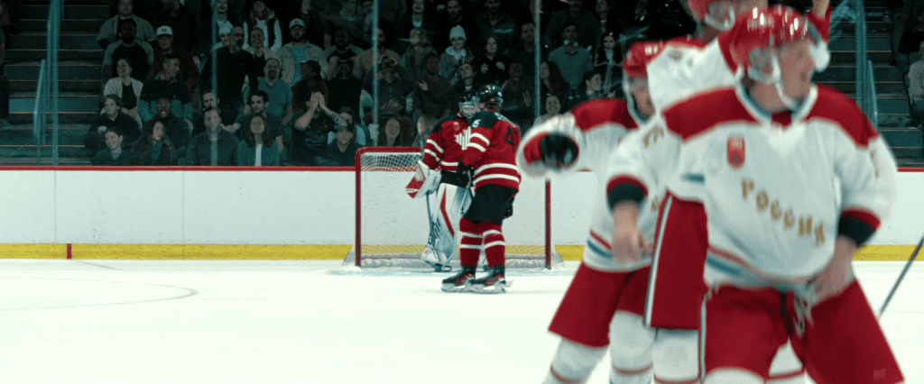
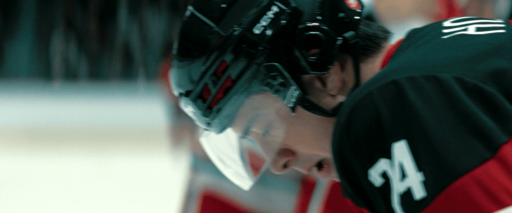
While I’ve stumbled on mentions of the use of anamorphic lenses on the show, I haven’t heard much discussed about the why of it all beyond “it makes the show feel more like a movie” and “it makes it look expensive,” because these lenses are typically used in film rather than TV productions.
(Especially in Canadian TV productions.)
Still, that’s not a very satisfactory answer to the question.
Sidenote (and a hot take):
There is such a thing as a stupid question.
“What pencil do you use?” is a stupid question if you think the answer means that drawing with a Blackwing means you’ll be able to animate like Glen Keane (or draw like Schulz if you ink with an Esterbrook nib.)
(More on that later.)
I’ve never met or talked to Jacob Tierney, but I’m pretty confident he didn’t decide to film his series with anamorphic lenses just because that’s what they used on Shogun and he thought that it looked neat.
Cinematic.
Expensive.
As with everything, it all boils down to intention. And Heated Rivalry isn’t a a show about hockey.
It’s a show about people. Who happen to play hockey.
Contrast the show’s usual shooting methods, even on the ice, but when what’s at stake are the characters and their relationships…
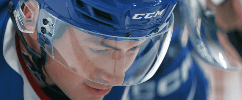
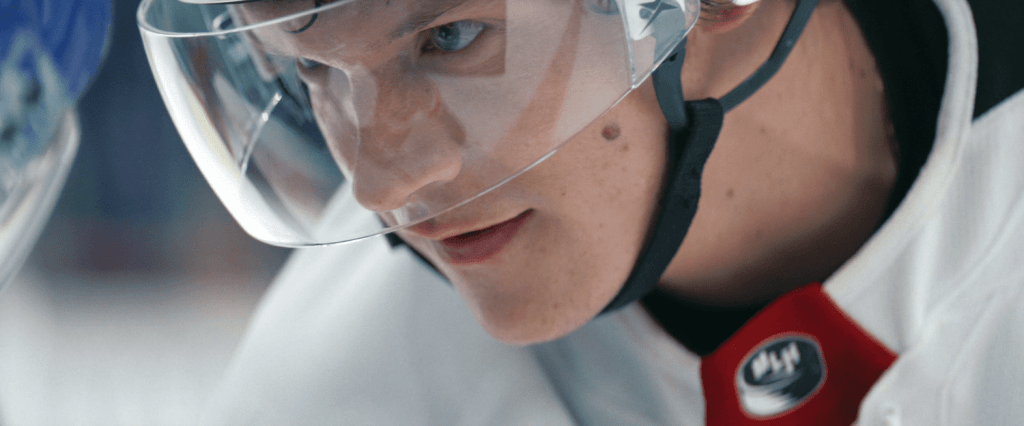
….with moments where the focus is actually on the game (and from a more detached and neutral narrative point of view):
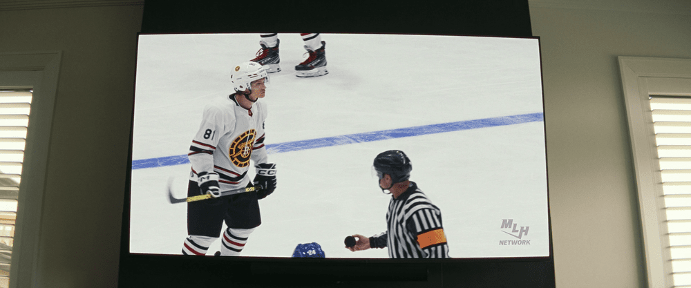
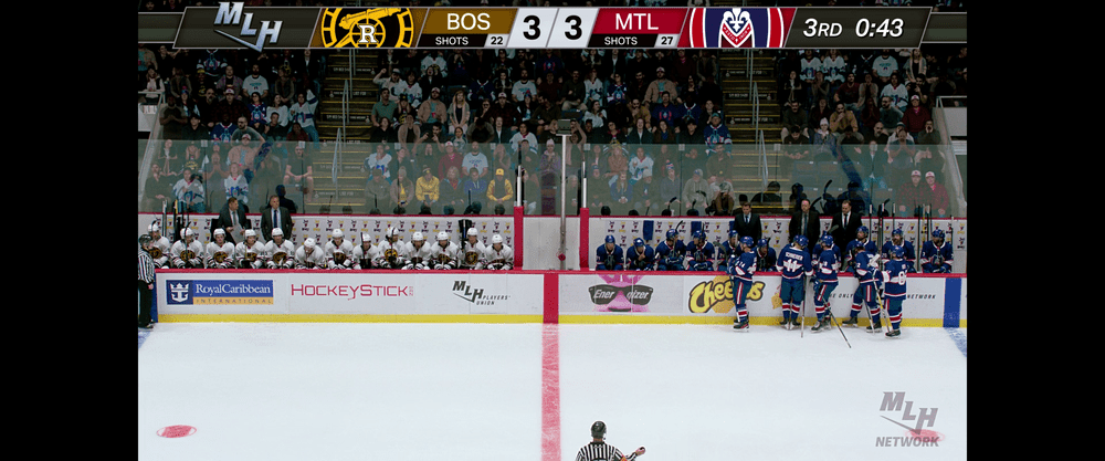
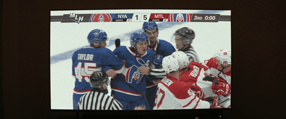
SO CRISP! I LOVE the stark contrast between the two types of shots on the show so much. You can practically make out everyone’s face in the audience in that middle image!
But, again, that’s not what this show’s about.
It’s an intimate story at every level, and that’s reflected with an intimate visual narrative point of view. We’re with only a small handful of characters. We’re very close to them, narratively and visually. This is a show about characters with deep, internal turmoil, and who feel extremely isolated from their environment, from their teammates, and from each other.
(And for good reason! Just clock the vibes of this recent clip featuring Habs players asked about the show… OOOF.)
Anamorphic lenses were a wonderful choice to mirror this interiority and to bring it to the screen. What were once considered “flaws” and optical byproducts are now intentional elements that can be used to communicate visually.
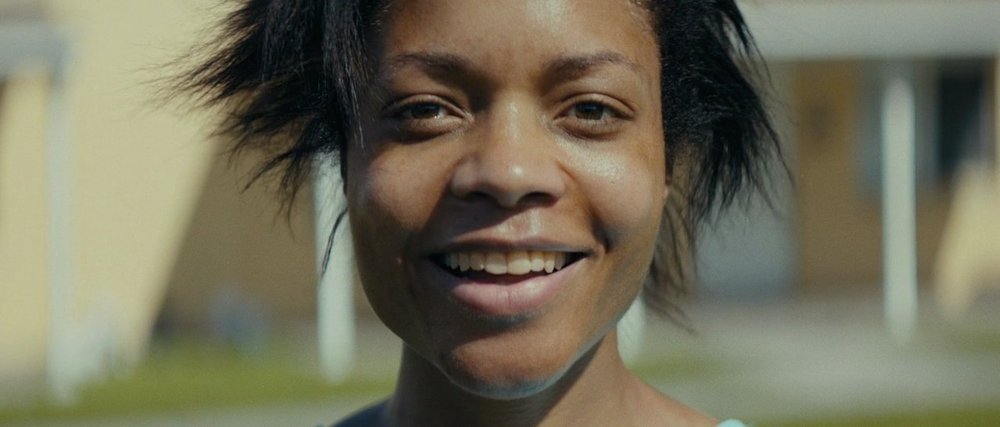
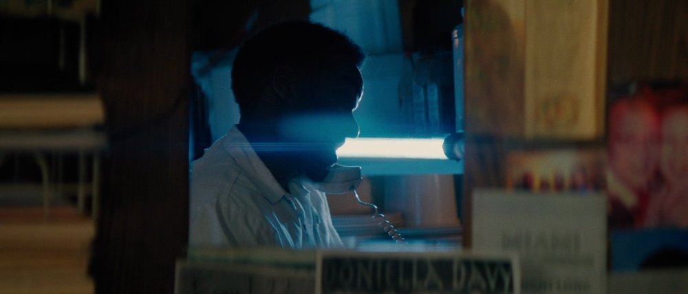
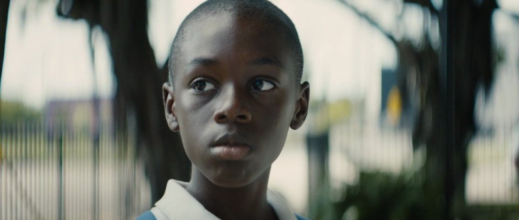
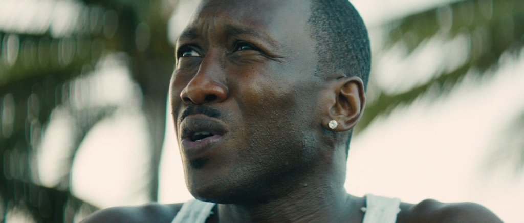
When I think of the use of anamorphic lens, my mind tends to go to Barry Jenkin’s Moonlight (thanks, Peter Markham!) Like Heated Rivalry, it also features a story where the focus is on the characters, their complex relationships, a deep interiority, and everything that remains unsaid. It’s another excellent example where the use of anamorphic lenses adds additional depth (ba-dum-pshh!) and meaning to the end result.
These are the types of stories where anamorphic lenses shine (sometimes literally!), giving us a clear focus on characters at the expense of a more naturalistic and neutral image.
Yes, the images are gorgeous, but it’s more than just about making pretty pictures.
OK. That’s all great.
But how does this all apply to 2D animation? Cameras can be used quite extensively in 3D, but it’s an extremely limited and simplified tool on the 2D side. There are no lenses to speak of.
Before we talk about animation, let’s make a detour to comics for a second, and consider what for many is THE comic strip: Peanuts.
Although he didn’t (directly) work in a screen medium, I like to argue that Charles Schulz’s work is extremely cinematic. Despite their simple surface, his strips constantly put conventional animated fare to shame.
If you pay close attention, you’ll see that he (intuitively?) moves an imaginary camera around as he draws his strips. There’s often great examples of this going on in his Sunday strips:
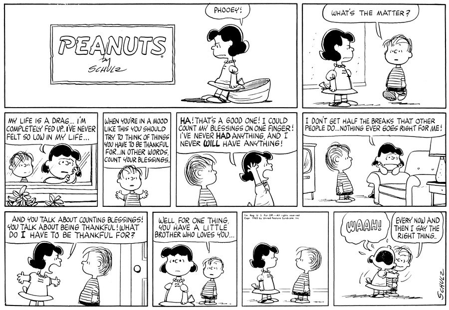
How nice is that 3rd panel?? How many animated productions would think to “put the camera” outside for a moment like this to emphasize Lucy’s rejection of her brother’s well meaning concern?
And, yes, it makes sense to “cut close” to Linus in the 4th panel as he delivers a long bit of dialogue to his big sister so that his wall of text fits neatly in a comic panel but, just like in film and television, it also momentarily shifts the narrative point of view of the story. We’re with Linus as he speaks.
We get a clear shot of his expression.
We can tell that he’s sincere.
Thankfully, right from the strip’s first adaptation into animated specials with A Charlie Brown Christmas, this visual language was something that was carried over.
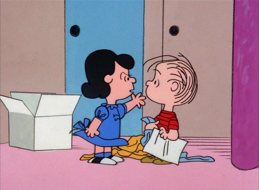
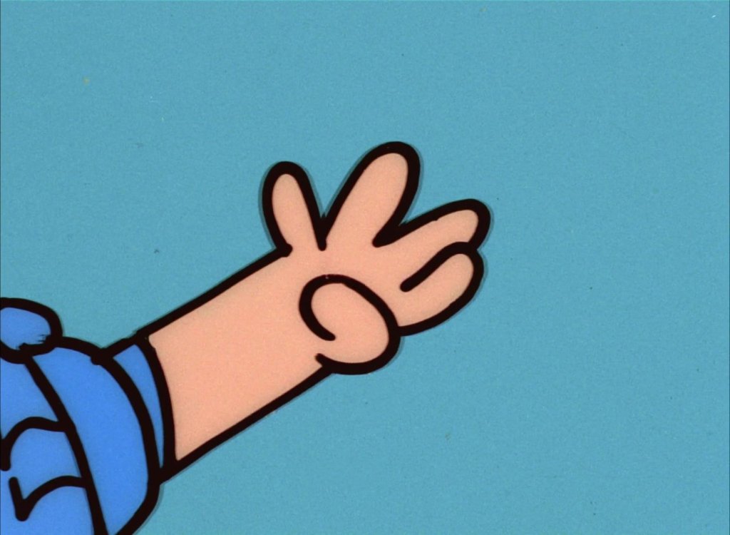
OK, it’s not a talking head shot, but! As we cut from the previous wide shot to focus on Lucy’s arm, we lose any indication of that brownish wall. Which, let’s admit it, your typical 2D production would tend to do a straight cut in on. But no. A slight camera shift, and a nice, clean flat blue colour card instead.
Simplicity and clarity are prioritized.
Similarly, as we cut from this wider shot of the kids to a tighter one of Lucy, some more interesting things start to happen…
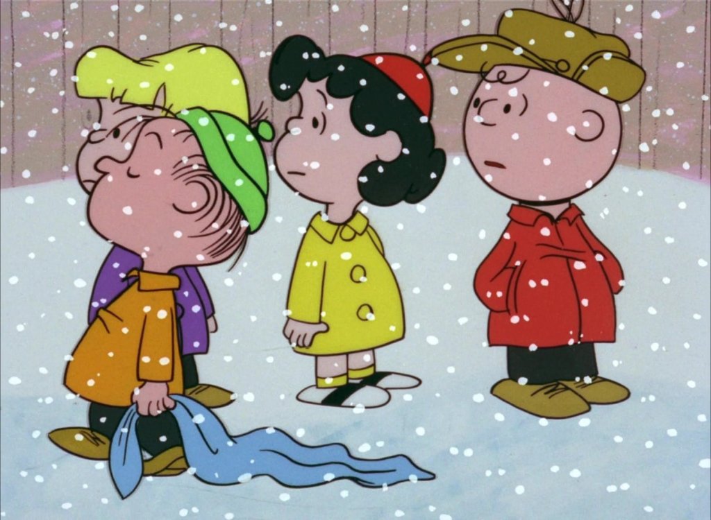
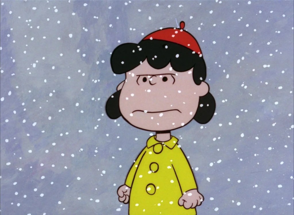
We lose the other kids! We lose the background elements (the ground, the fence) from the previous shot! It’s as if the camera is tilted up, and we only see the sky (which was not in the previous shot) behind Lucy, as the snow continues to fall.
Isn’t this… wrong?
Well, wrong is in the eye of the beholder.
Me? I agree with Bill Melendez’s decision to ditch everything that this shot isn’t about. Again, simplicity and clarity. All that matters in this scene is that Lucy is pissed. So pissed, the world essentially falls away. It not only puts us in her shoes, it invites us into her head, into her state of mind…
Add the brown fence rather than the stormy, atmospheric clouds, and the shot would feel different.
As Chip Kidd puts it in his hommage to Schulz’s work: Only What’s Necessary.
Things follow a similar logic in this next sequence. The “camera” “swings around” so that Charlie’s now in the foreground, with Lucy in the back (similar to panels 3 and 8 in the Sunday strip above!) The curtain’s purple is kept, but its vertical lines are lost. They would’ve been doing too much in the shot.
Distracting.
Muddying.
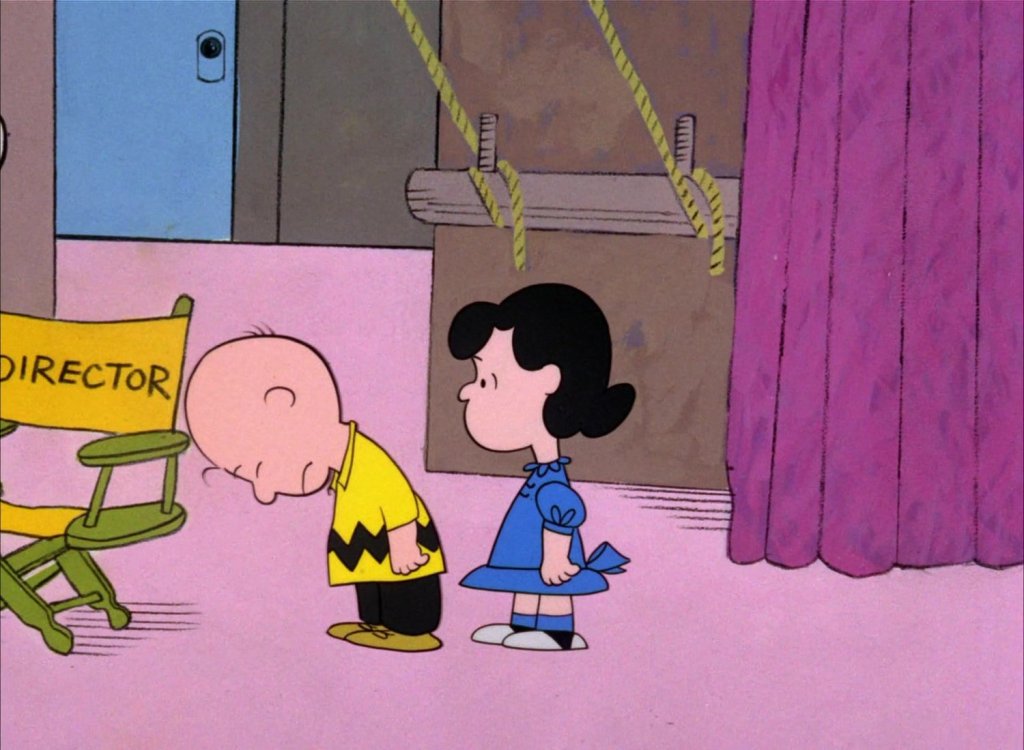
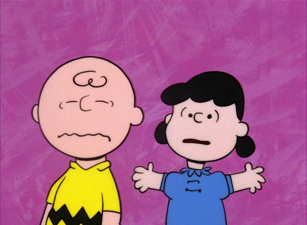
Just as if we were using an anamorphic lens, the curtain melts and blurs and we’re left with the only thing that matters in this moment: the characters.
And finally, we get to the real good stuff…
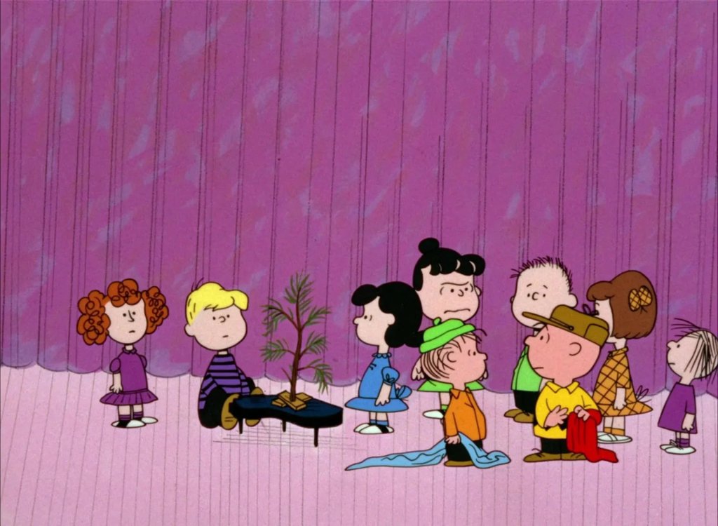
As Violet and Patty viciously tear into Charlie Brown, the emotional nature of their shots completely overrule logic.
BAM!
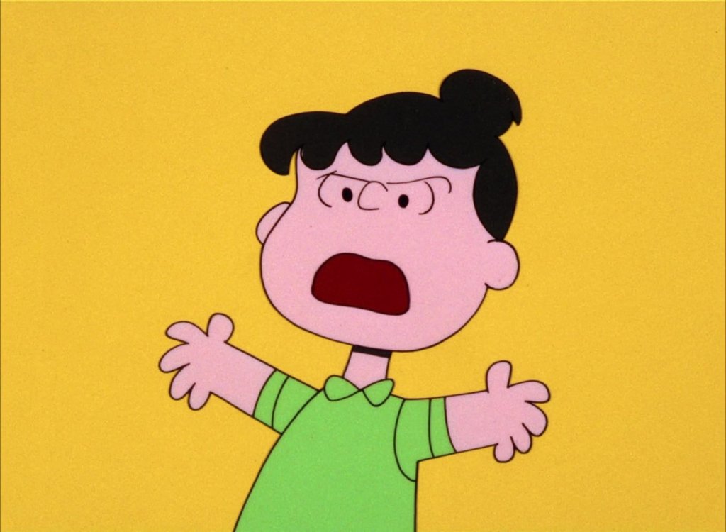
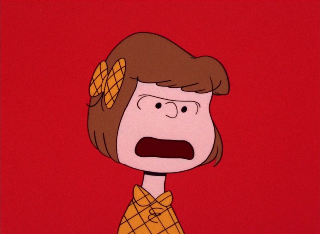
SO BALLSY!
And, so fun!
And, so clear.
There’s no mistaking it — for Charlie, this hurts.
When I was directing episodes of The Snoopy Show and Camp Snoopy, colour cards were surprisingly confusing sometimes. Which is why I always referred our story, design, and layout crews to the way anamorphic lenses are used in live-action to explain not only their technical effect (they blur the BG!), but how they allow us to enter a character’s mental bubble.
Sometimes, that character is the one who’s on screen, as was the case with Lucy against the snowy sky.
Sometimes, paradoxically, that character is offscreen, as is the case in the Charlie/Violet/Patty triangle above, or with Paula (Little/Chiron/Blue’s mother) in Moonlight.
Again, it all boils down to intention, and what choices you can make to amplify and clarify that intention.
Who cares if it looks cool.
Or cinematic.
Or expensive.
 MÉLANIE DAIGLE